Make an Appointment
When building a website for the first time, many of us focus a lot on content and design, considering website photos an afterthought. Yet, images should be seen as just as important to your website as the words and the pages. So, with that, we’re here to help.
If you are part of the Physio Inq Business Partner network, our marketing team will hold your hand during this process. If you want to learn more about our Network or have any questions, you can reach out to us here.
But if you’re not part of our network, we’re sharing how quality images can improve your website and some photography tips to make sure your website photos stand out for the right reasons.
The Importance of Photos for Website Success
The first and main reason why it’s important to have quality photos on your website is that they’re much better at capturing a user’s attention than are blocks of text.
Images act, not only as eye candy for your website visitors, but they can also convey useful information. Images visually describe what products you offer or what services you provide.
Plus, images also boost your search engine rankings. Not only do search engines rank websites with images higher than those without them, but there are even ways to add keywords to your images that optimise your website from the inside out.
By using image “alt text” and captions, you can give your website an extra kick of SEO through imagery. We’ll explore these SEO tactics more below.
Types of Website Photography
There are a few common types of website photography that can really enhance user experience. Below, we’re explaining what’s what.
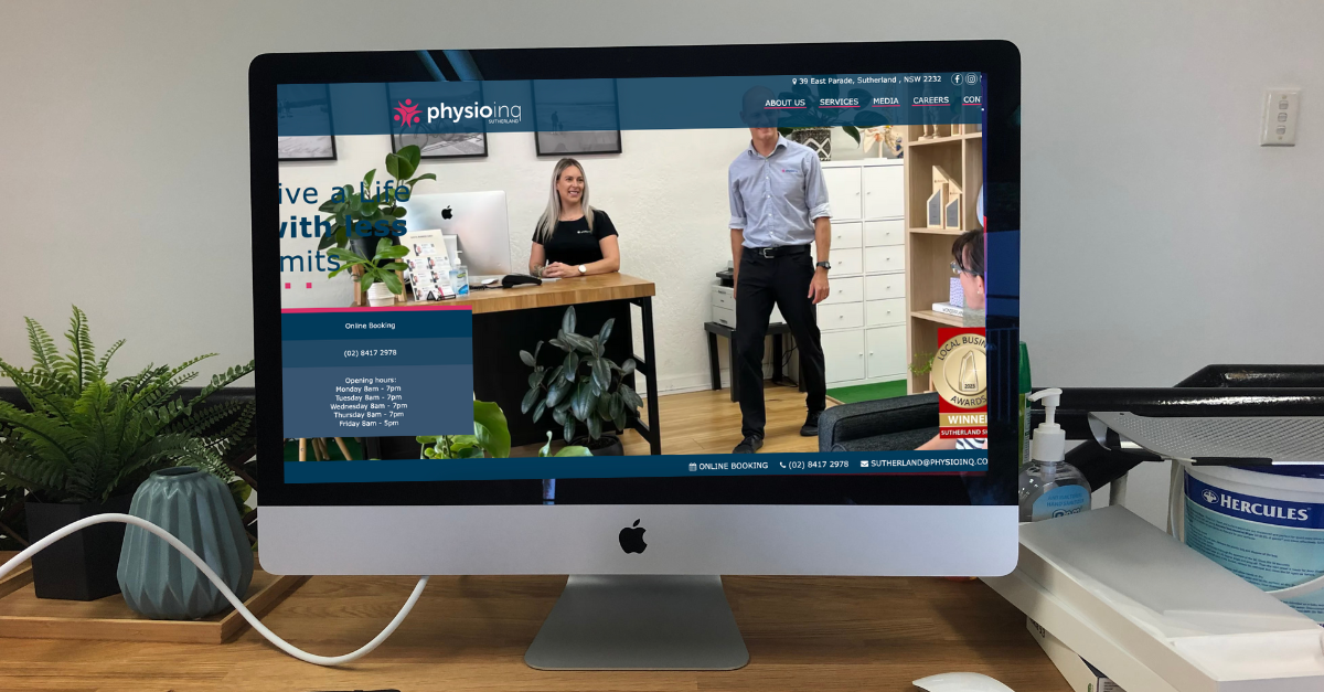
Top Banners

Banners across the top of your website are the first thing visitors see when checking out your website. It’s you’re chance to really communicate who you are and what you provide without users needing to scroll down but enticing them to do so.
You might add some text on top of the image to drive home your message and some banners will even have a “swipe” feature on a carousel to communicate multiple messages.
Generally, these images should be between 1500 and 2500 pixels wide.
You might’ve also heard of banner ads and these are a little bit different. Since you won’t place ads on your own website, we’ll leave the topic of banner ads for another time.
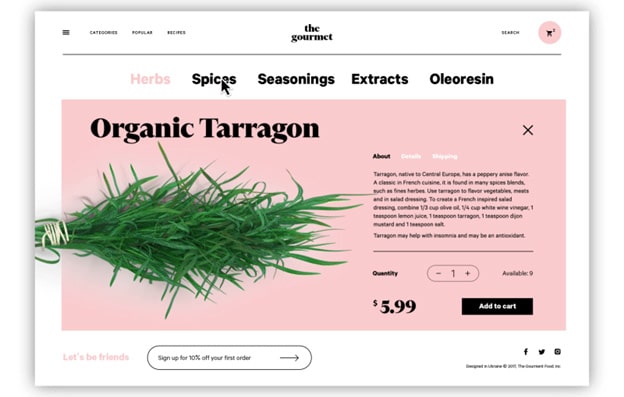
Feature Images

Image Source: Tubikstudio.com
Feature images are usually presented on a specific page, with a blog post, or to separate different messages from one another.
For example, a physio practice might place one feature image for their occupational therapy services and another to represent their sports physiotherapy services on the same page. Overall, featured images are a wonderful way to add visual variety throughout your website.
The size of your feature images will often depend on your website design. So, always double-check that the formatting is ideal when publishing these photos. More on sizing your images down below.
Staff Headshots
When it comes to the people at the heart of your business, it’s so important to make sure that they’re represented professionally and prominently.
Quality staff headshots are essential because customers want to know who they’re working with and seeing the faces of the people who work at your company all adds to your brand storytelling.
It can also help organise the customer experience by making it clear who does what and why they matter.
So, while feature images and other more marketing-heavy photos are important in how to improve your customer experience with good imagery, staff photos are also a huge piece to the puzzle.
Website Photography Tips
If you have the means to hire a professional photographer for your website images, then start there. However, you don’t need to necessarily spend much money to take great photos for your website.
Here are a few tips to help you take better photos for a professional-looking website.
- Get the Gear: A quality camera and a decent editing program can go a long way. If worse comes to worst, most modern phones take great quality images. If you have a friends or family who has a good quality phone, ask them if they could come over and take some snaps.
- Understand Lighting: Get to know the basics of lighting to ensure a high-quality DIY photo. Where you can, try and use filtered natural light. It will make sure your images come out clear, bright and welcoming. Some locations may not have access to natural light. And that’s okay. If you have a professional photographer, they will be able to provide appropriate lighting. If your flying solo, try brining in overhead lights, floor lamps and desk lamps to help brighten the space.
- Go Easy on the Editing: A little bit of editing can help make your photos look more professional but overdoing it on the filters can also look tacky and amateur. The aim of business phones is to make it look as natural as possible.
A Note Website Image Sizes
The size of your images matter for a few reasons.
First of all, if your image files are too large, they can take forever to load. When a page on your website doesn’t load properly, bounce rates go up. So, by compressing your high-quality photos, you have a better chance of keeping visitors on your website.
Another reason size matters are for basic design aesthetics. If your featured image is awkwardly small, it throws off the entire design and, frankly, looks unpolished.
And finally, adjusting image size helps keep your high-quality images looking sharp. If you post an image that’s too big, you risk getting a pixelated photo, again, creating an unpolished look.
So, based on the recommended pixel sizes for the most common types of website images we mentioned above and from your website provider, stick to those sizes or resize your images to keep your website looking fabulous.
Best Practices for Website Imagery
Having images on your website definitely improves performance. After all, no one wants to be met with a bunch of text and no photos when they check you out on the internet. But, there are certainly some best practices when it comes to website imagery that you should know.
- Images on your website can improve SEO
- Too many images, however, can also be an issue
- Go for quality over quantity
- High-quality original images are preferred over stock images
- Stock images are best to be left for blog posts and less prominent website images
- Use keywords in the alt text of your website images
- Ensure your images are the correct size
So, let’s dive a little deeper into some of these best practices.
As much as no images can be a bad sign, too many images scattered across your site can also be a problem. They take longer to load which might send people away and, with too many photos, your website can easily look cluttered and like spam.
So, as with anything in digital marketing, go for quality over quantity. Add only relevant images but make sure they’re as high-quality as you can make them.
Also, go easy on the stock images. They’re useful in some cases for blog post images and such, but original images (when done well) will always stand out as more professional and trustworthy.
However, if you don’t have high-quality original photos, stock images are better than nothing.
Additionally, to improve SEO, make sure all of your images have “alt text” that describes the image with keywords. This is a great way to embed text into the code of your website without requiring a professional developer.
Plus, when you have images on your website, you’re far more likely to get those sought-after clicks from search engine results. Using the “alt text” helps get those results.
And finally, as we already mentioned, ensure your images are the proper size to create a professional, polished look on your website. Always avoid pixelated or awkwardly placed images.
As with all website development, working with website images takes time. It’s a process and making your website look the best it can be will always be a work in progress. So, use these tips to do your best but most of all, just get started.
We know it’s a lot of information but just play around with it! You’ll get the hang of it soon enough.
Date Published: Friday, January 29, 2021
Date Modified: Tuesday, July 16, 2024
Need to get into direct contact with ur Client Services team? We're all ears. Call our team directly on 1300 731 733
